
DESIGN SUMMARY
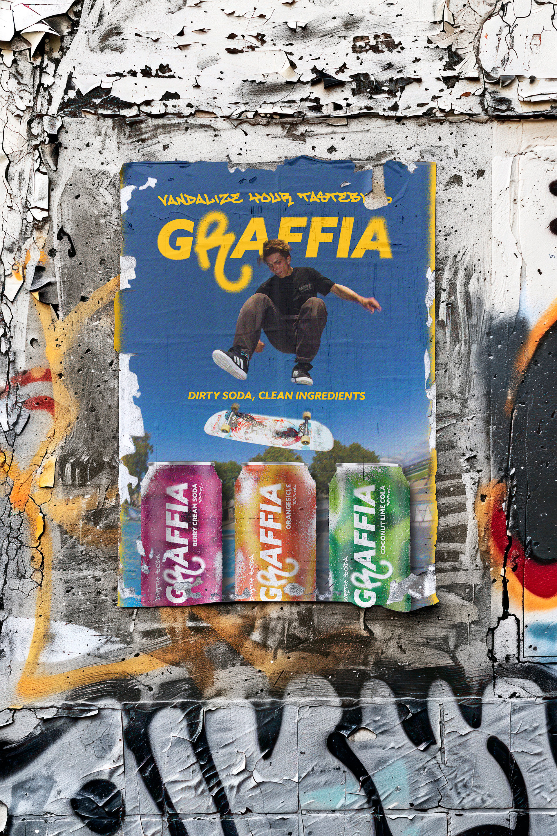
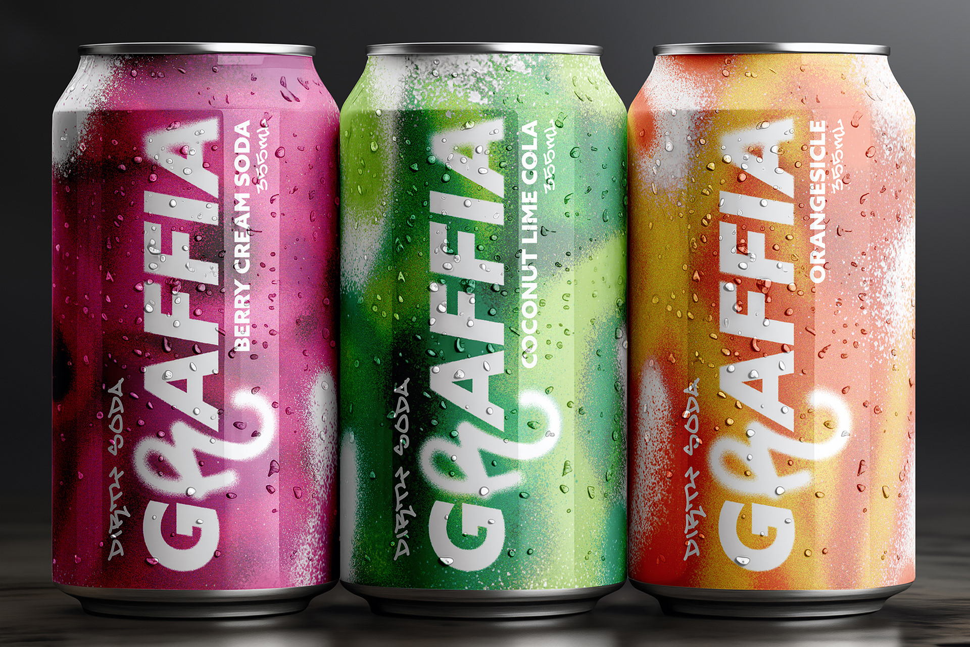
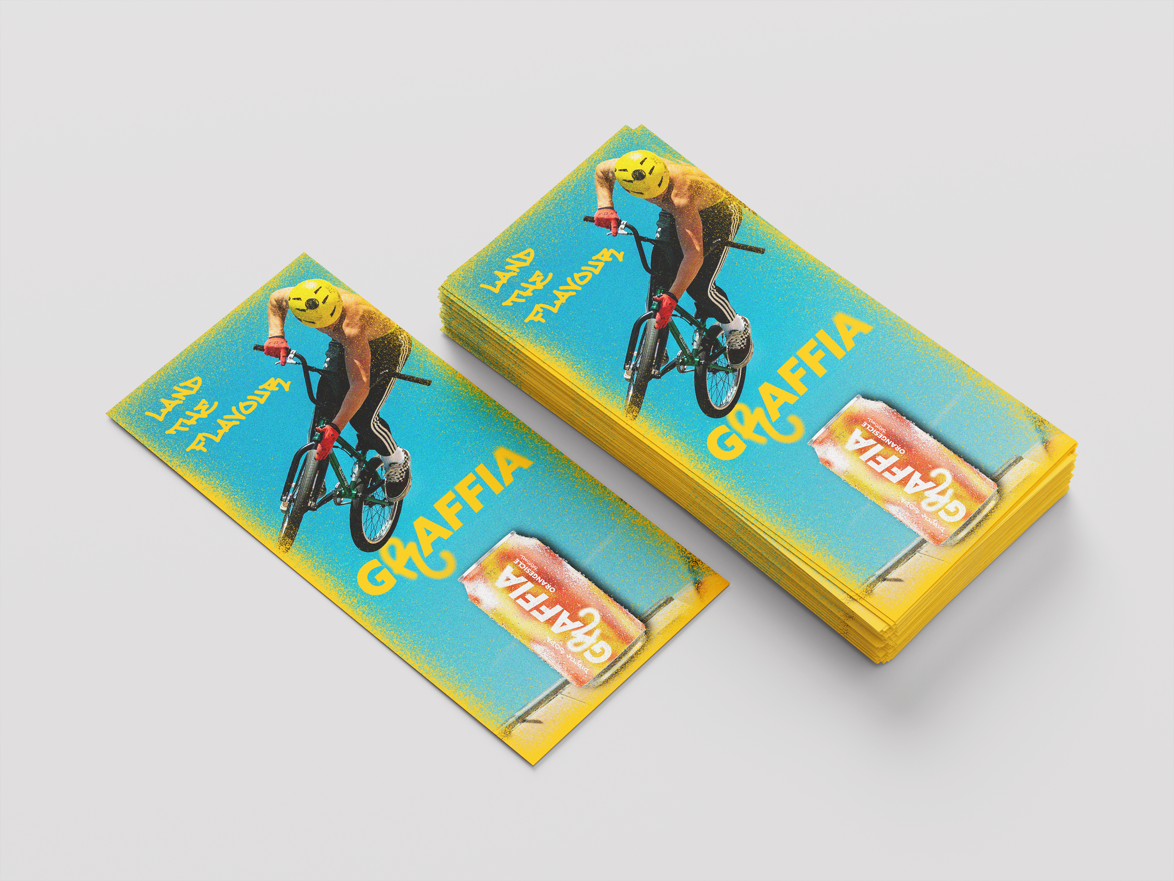
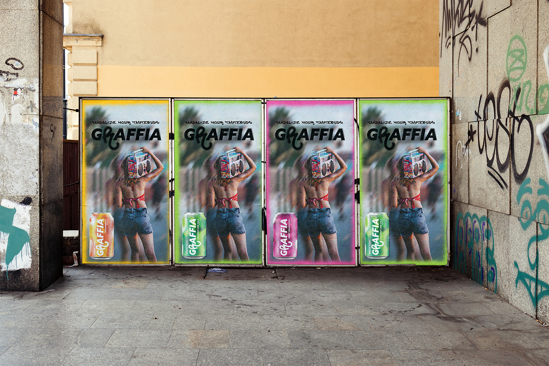
With the rise of the ‘dirty soda’ — the combination of pop with syrups, creams, and additional ingredients to up a soda’s flavour, Graffia is the first ever dirty soda in a can. Graffia is a soda sprayed with flavour, never with junk, promoting the idea that a soda can still be fun and exciting with cleaner ingredients. The branding and overall packaging design were inspired by graffiti through its street and skatepark style, and by the concept of vandalism, considering it through the additional ingredients added to these sodas. Graffia is advertised to suggest it’s a dirty soda, but made with clean ingredients that contrast with Graffia’s messy yet intentional art style. Graffia allows for exploration of flavour while emphasizing health and clean ingredients.
MAIN GOAL
How can I design a soda pop that uses healthier ingredients yet still be a fun, exciting drink? As a designer, how can I advertise and brand this company to attract its audience and spark people's interest in trying the beverage?
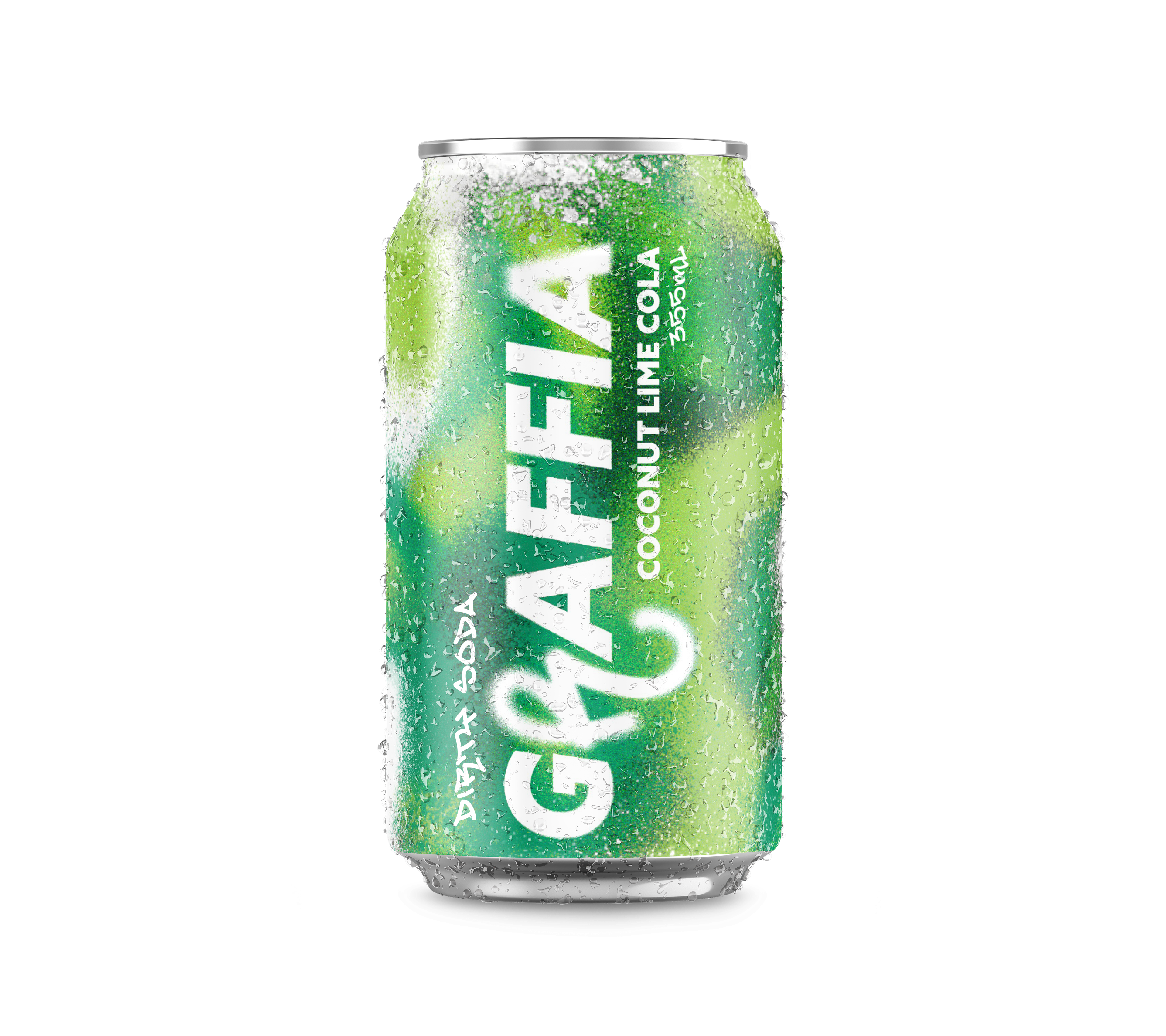
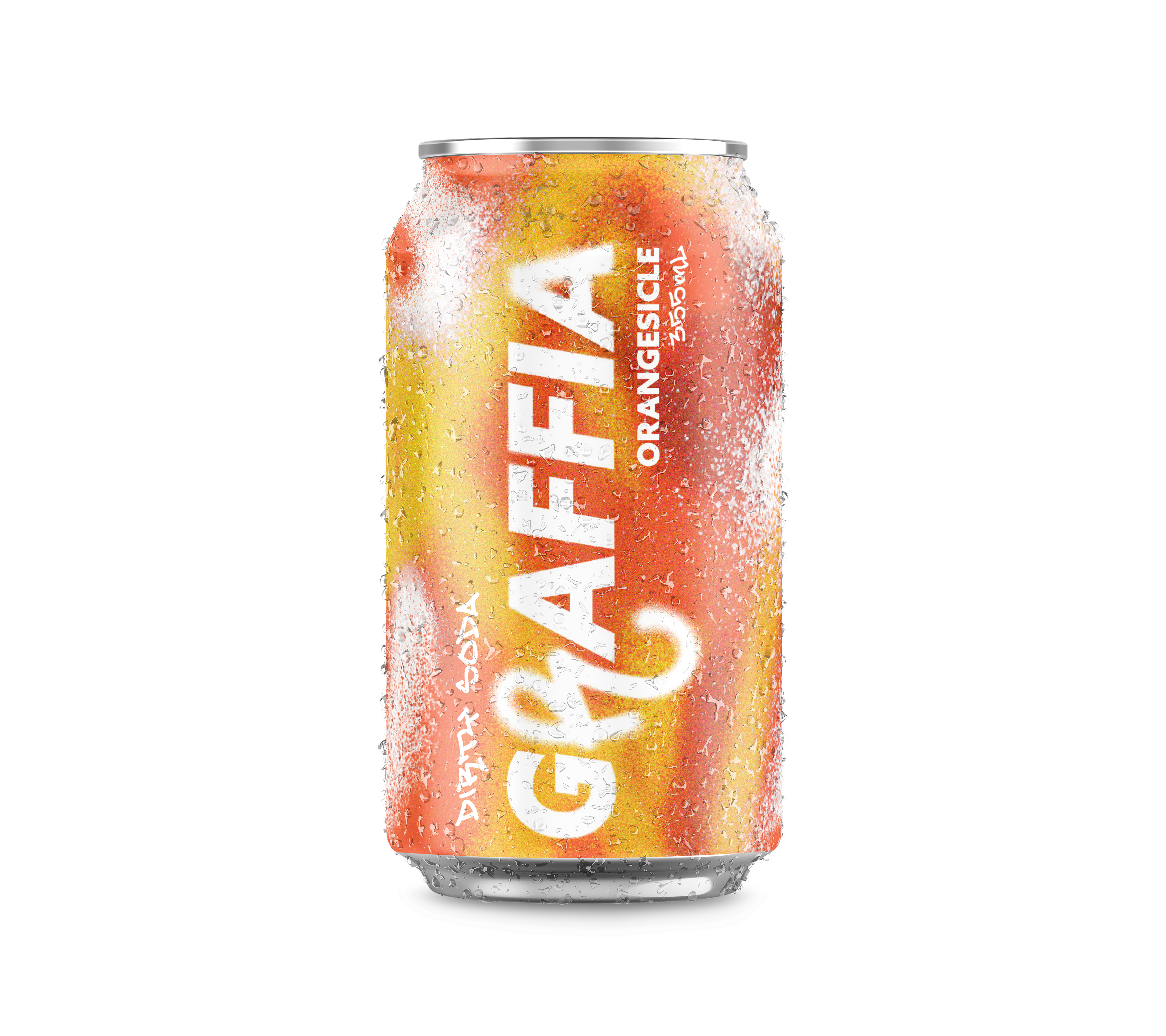
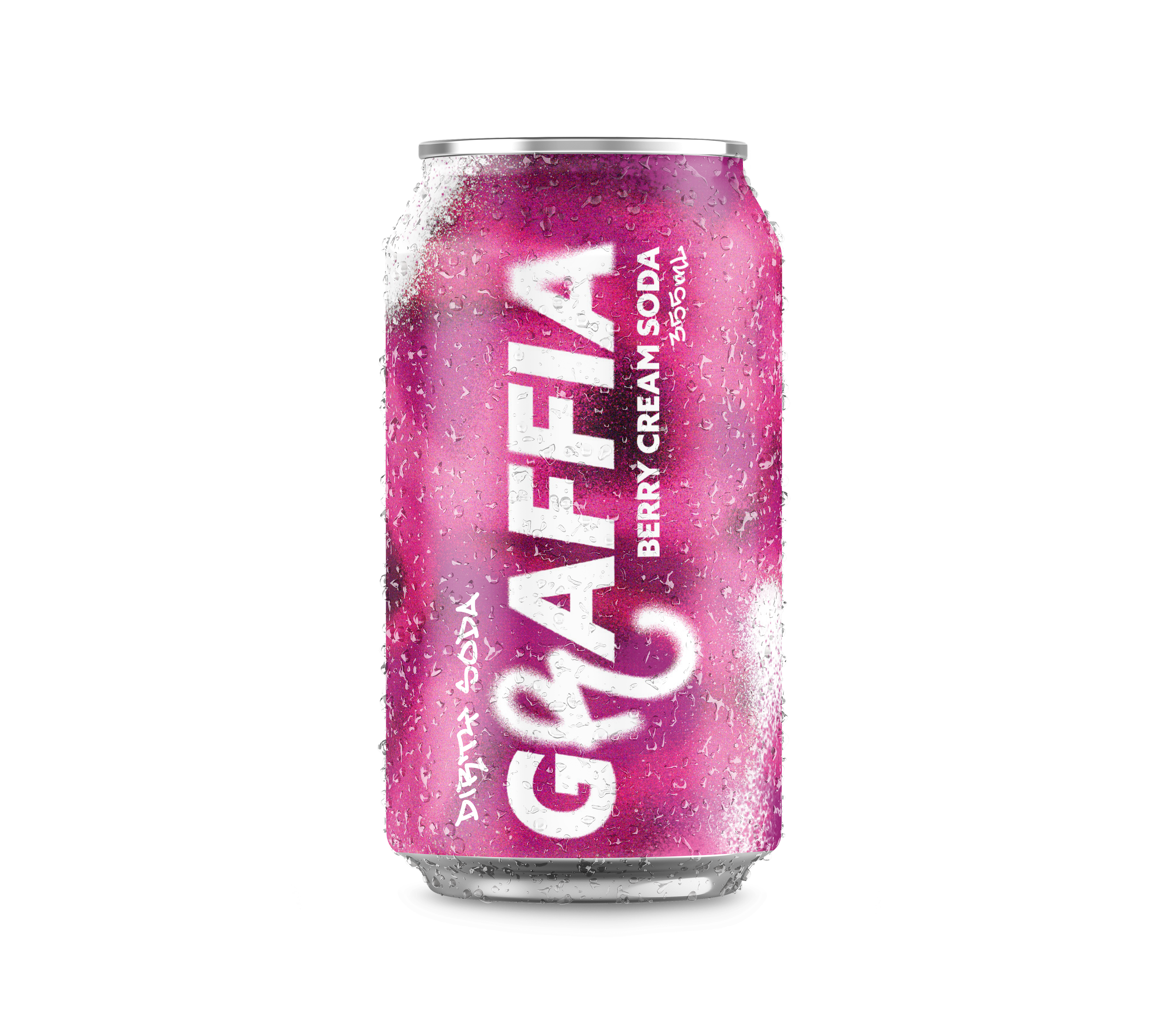
FLAVOURS INCLUDE
Berry Cream Soda, Coconut Lime Cola, & Orangesicle
BRAND IDENTITY
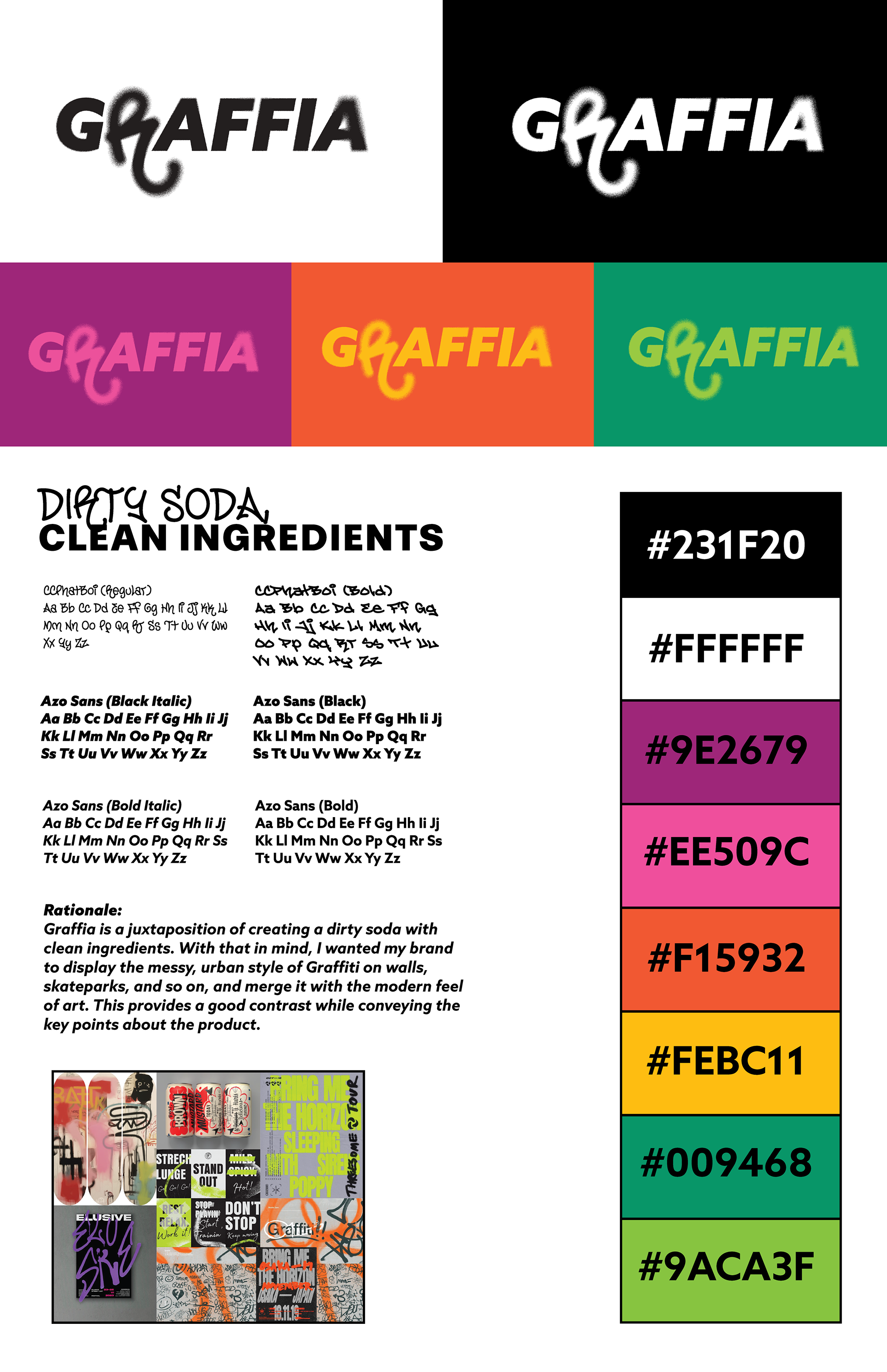
For the Logo design and Brand feel, I wanted it to feel very modern, yet playful. I was thinking of a modern-designed art gallery filled with abstract work. A very humanistic approach to graffiti and grunge styles.